Marketing Materials
Trifold vs Bifold Brochures: Optimizing for Conversion
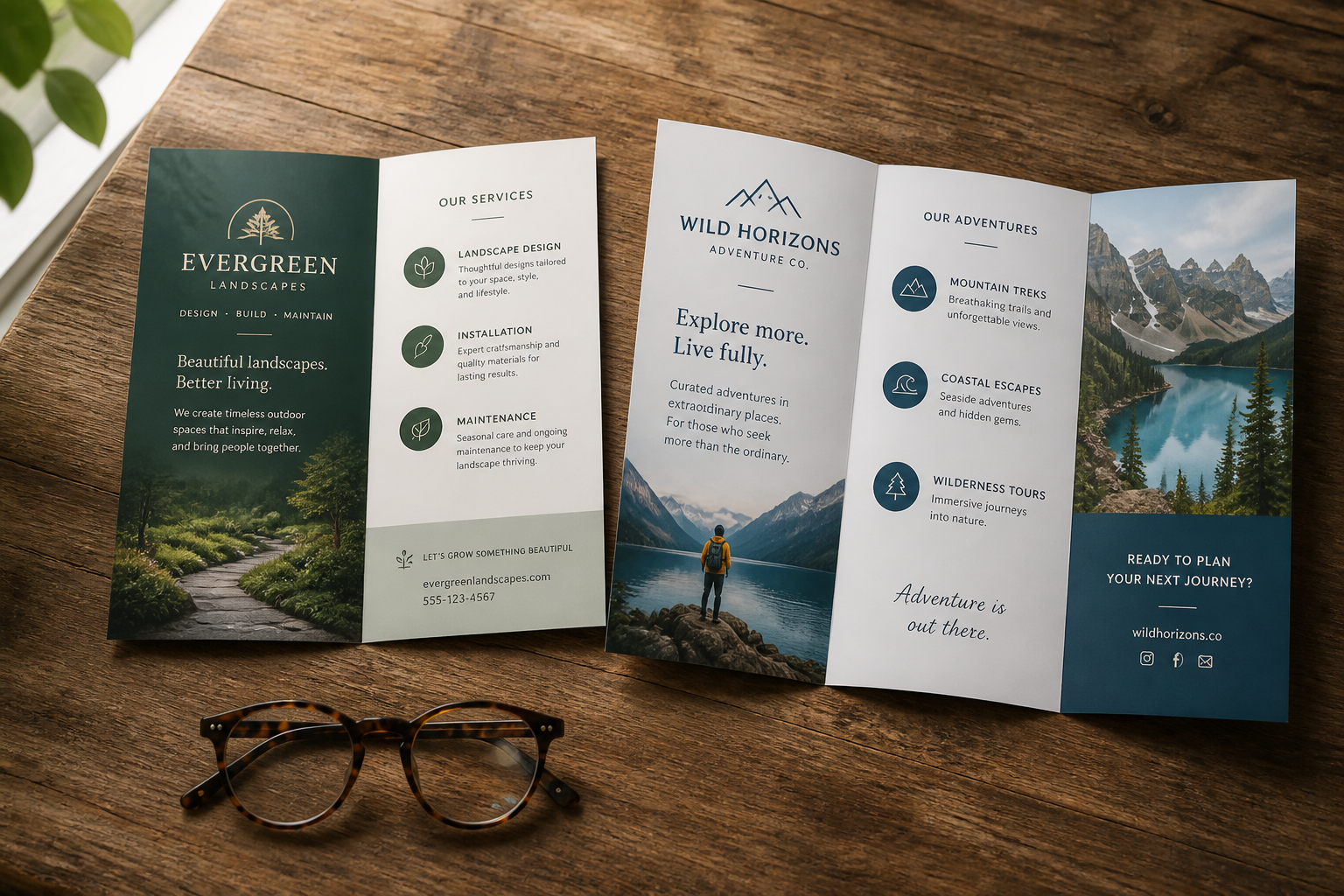
Brochures remain a foundational marketing tool for many businesses. They offer a tangible, portable way to convey information, introduce products or services, and generate leads. However, the effectiveness of a brochure isn't solely about its content; the format plays a significant role in how that content is accessed, understood, and ultimately, whether it prompts action. Two of the most common formats, trifold and bifold, each present distinct advantages and challenges for design and communication.
Understanding the inherent differences in reader interaction with trifold versus bifold layouts is crucial for maximizing their impact. This involves considering how information naturally flows, the initial impression each format creates, and the psychological cues they send to a potential customer. Selecting the right format is not a trivial decision; it directly influences message clarity, engagement, and conversion rates for your marketing efforts.
Understanding Reader Behavior: The Initial Interaction
The moment a potential customer picks up a brochure, a sequence of decisions begins. For a bifold brochure, the primary decision is whether to open it or not. The cover must immediately communicate value or intrigue. Once opened, the interior presents a single, larger canvas. This simplicity can be inviting, reducing cognitive load and encouraging a direct read through. The reader's path is generally linear: cover, interior spread, back. This format often feels like a mini-book or a direct mail piece designed for immediate consumption.
A trifold brochure, conversely, introduces more visual complexity from the outset. The standard tri-fold, also known as a letter fold, has an outer panel that folds inward, creating a three-panel front when closed. The reader's first interaction is with this outermost panel, which must serve as a compelling introduction. Opening it reveals a five-panel interior, followed by the final back panel. This multi-panel structure creates a sense of discovery, but it also demands a more deliberate unfolding process. Designers must anticipate and guide the reader through this sequence effectively to maintain engagement.
Panel Layout and Information Flow: Crafting the Narrative
The panel structure of each brochure type dictates how information should be organized and presented. Bifold brochures excel when presenting a clear, concise narrative or when showcasing a limited number of high-impact visuals. The large interior spread is ideal for a hero image, a detailed product feature, or a compelling story that unfolds across two pages. This format supports a linear progression of information, making it suitable for step-by-step guides, event schedules, or simple service overviews. The back panel can then be used for contact information or a strong call to action.
Trifold brochures offer greater versatility in information segmentation. The six distinct panels allow for breaking down complex topics into digestible chunks. Imagine presenting three key benefits, each on its own panel, or detailing different service tiers. The sequential reveal of panels can be used to build anticipation or guide the reader through a logical progression, such as problem, solution, benefit. However, this structure demands careful design to ensure a seamless flow and prevent a disjointed experience. Designers must map out the reader's journey across all six panels to maintain coherence and prevent confusion.
When a Bifold Brochure Wins: Simplicity and Impact
A bifold brochure is often the stronger choice when your message is straightforward and demands immediate attention. Consider scenarios where you need to showcase a single product, promote a specific event, or provide a brief company overview. The larger interior canvas offers ample space for striking visuals and minimal, impactful text. This format is effective for handouts at trade shows where quick comprehension is key, or as part of a direct mail campaign where brevity and a strong visual hook are paramount.
Its simplicity also translates to a lower cognitive burden for the reader. There are fewer folds to navigate, and the information is presented in a more traditional, book-like manner. This can make it feel more substantial and easier to retain key messages. For businesses needing to convey a premium feel or highlight a single, high-value offering, the bifold's uncluttered presentation can be highly effective.
When a Trifold Brochure Wins: Detail and Discovery
The trifold brochure shines when you have more information to convey, but still need to present it concisely. Its multi-panel structure allows for detailing multiple services, outlining features and benefits, or answering common questions within a single piece. This format is excellent for educational materials, product specification sheets, or general company brochures that need to cover several facets of a business. The ability to compartmentalize information without overwhelming the reader is its primary strength.
The "unfolding" experience of a trifold can also be leveraged creatively. Designers can use the progressive reveal of panels to tell a story, build an argument, or guide the reader through a discovery process. This can lead to a more engaging and memorable interaction. For businesses providing diverse services or needing to explain a complex process, the trifold offers the necessary real estate to present comprehensive information in an organized, approachable manner. It's often the preferred choice for displaying price lists, membership benefits, or detailed program information.
Optimizing for Conversion: Design and Call to Action
Regardless of format, conversion hinges on clear design and a compelling call to action (CTA). For bifold brochures, ensure the CTA is prominently placed on the interior spread or the back panel. The directness of the format supports a single, strong directive. Visual hierarchy is critical: lead the eye to the most important information and then to the desired action. Utilize high-quality imagery and a clean layout to maintain focus.
With trifold brochures, the CTA can be integrated into the sequential flow. Perhaps an initial panel prompts interest, a middle panel provides details, and the final accessible panel delivers the CTA. Ensure your contact information – website, phone, email, physical address – is easily found, typically on the back panel. A QR code can also bridge the gap between print and digital, providing an immediate path to conversion. Both formats benefit from professional printing to ensure colors are vibrant and text is crisp, reflecting positively on your brand and reinforcing the perceived value of your message.
Frequently asked questions
- Which brochure type is cheaper to print?
- Generally, the cost difference between a standard bifold and trifold brochure, when using the same paper stock and quantity, is minimal. Both involve a single sheet of paper and similar production processes. Specific design complexity or unique folding patterns could influence pricing slightly, but the format itself is not a major cost driver for most print shops.
- Can I use both formats for the same product or service?
- Yes, using both formats strategically can be effective. A bifold might serve as a quick overview handout at a fair, while a trifold offers more detailed information for interested prospects. This allows you to tailor your message depth to different stages of the customer journey, providing just enough information without overwhelming or underselling.
- What common mistakes should I avoid with brochure design?
- Avoid overcrowding panels with text or images; white space is crucial for readability. Ensure your font choices are legible and consistent. A common mistake with trifolds is ignoring the panel order, leading to a disjointed narrative when opened. With bifolds, a weak cover design can prevent the brochure from ever being opened. Always include clear contact information and a direct call to action.