Design & Prepress
Print-Ready Artwork: Bleeds, Safe Zones, and CMYK Explained
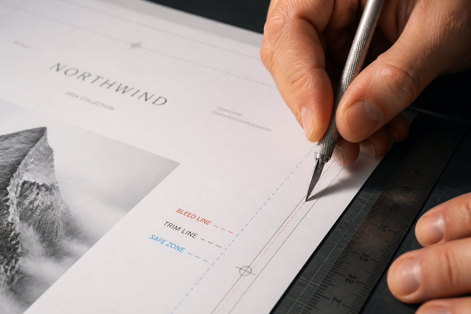
Sending your meticulously designed business cards, brochures, or postcards to a commercial printer should be a straightforward step. However, many small business owners and marketing managers encounter a common hurdle: artwork rejection due to improper file setup. This isn't a printer trying to be difficult; it's about ensuring your final product looks exactly as intended, without unexpected white edges or cut-off text. Understanding a few fundamental print concepts can save you time, money, and frustration.
This guide demystifies the critical elements of preparing print-ready files. We'll cover the 'why' and 'how' of bleeds, safe zones, and the CMYK color mode. Properly setting these up ensures your print job comes out professional and consistent, from a stack of business cards to a large-format banner. A little attention to detail upfront means your print collateral effectively represents your brand without costly reprints.
Understanding Bleeds: Preventing Unwanted White Edges
A 'bleed' refers to the portion of your design that extends beyond the trim edge of your printed piece. When a commercial printer cuts your design to its final size, there's always a slight margin of error, typically a fraction of a millimeter. If your background color or image stops exactly at the trim line, this tiny shift can result in a thin, unsightly white sliver along the edge of your finished product.
To prevent this, designers extend all background elements, colors, and images past the intended cut line. Standard bleed measurements are typically 0.125 inches (1/8 inch) on each side for most smaller print products like business cards, postcards, and flyers. For larger formats, such as posters or banners, a 0.25-inch bleed might be recommended. Always check your printer's specific bleed requirements; they can vary slightly by product and equipment. Incorporating bleed ensures that even if the cut is not perfectly precise, your design will still extend to the very edge of the paper, creating a professional, finished look.
Most design software, like Adobe InDesign, Illustrator, and even Photoshop, allows you to set up your document with bleed margins from the start. This is the simplest approach. If your design software doesn't have a dedicated bleed setting, you can manually extend your artwork by the required amount beyond your document's final trim size. Just remember to communicate clearly with your print provider about your final trim size and the bleed you've included.
The Safe Zone: Keeping Important Content Visible
While bleeds address the outer edges, the 'safe zone' protects your inner content. Just as there's a margin of error when cutting, there's also a potential for minor shifts or inconsistencies. The safe zone is an inner margin, typically 0.125 to 0.25 inches from the trim line, within which all critical elements – text, logos, contact information, and important imagery – must reside. Anything placed outside this safe zone risks being partially or fully cut off during the trimming process.
Think of the safe zone as a protective buffer. If your business card has your phone number too close to the edge, a slight cutting deviation could shave off a digit. By keeping essential information within the safe zone, you guarantee its visibility and readability on the final printed piece. This applies to all types of print collateral, from simple one-page documents to complex brochures.
When designing, visualize these three areas: the bleed area (outside the trim), the trim line (where the paper will be cut), and the safe zone (inside the trim, where your important content must stay). Many professional design templates from Odd Jobs Media already include these guides, making it easier to place your content correctly.
CMYK Color Mode: The Language of Print
One of the most common reasons for color shifts between a digital design and its printed output is an incorrect color mode. Digital screens display colors using the RGB (Red, Green, Blue) color model. This additive model creates colors by mixing light, resulting in a vibrant and broad spectrum suitable for websites, videos, and digital art. However, commercial printing uses a subtractive color model: CMYK (Cyan, Magenta, Yellow, Key/Black).
CMYK colors are created by mixing inks that absorb certain wavelengths of light and reflect others. When you send an RGB file to a commercial printer, their software must convert it to CMYK. This conversion can sometimes lead to unexpected color shifts, as the CMYK gamut (the range of colors it can reproduce) is generally smaller than RGB. Bright blues, vivid greens, and intense oranges from your screen might appear duller or slightly different in print.
To ensure color accuracy, always design your print materials in CMYK color mode from the outset. Most design software allows you to specify the color mode when you create a new document. If you've already designed in RGB, convert the file to CMYK before sending it to print. Be aware that some color shifts may be unavoidable during conversion, so review the converted file carefully. Using CMYK from the start minimizes these surprises and helps you better anticipate the final printed appearance of your colors.
Resolution and File Formats: Sharpness and Compatibility
Beyond bleeds, safe zones, and CMYK, two other factors significantly impact print quality: resolution and file format. For commercial printing, a resolution of 300 dots per inch (dpi) at the final print size is the industry standard for sharp, clear images and text. Images designed at lower resolutions (e.g., 72 dpi for web use) will appear pixelated or blurry when printed. Always start with high-resolution source images, especially if they are photographs or complex graphics. Scaling up a low-resolution image will not improve its print quality.
Preferred file formats for print-ready artwork typically include PDF (Portable Document Format), AI (Adobe Illustrator), or EPS (Encapsulated PostScript). PDFs are generally preferred because they embed all fonts and images, maintaining your design's integrity across different systems. When saving a PDF, ensure you select 'Press Quality' or a similar preset that includes bleeds and high-resolution settings. Avoid submitting files in formats like JPEG, PNG, or GIF for primary artwork, as these are often optimized for web use and can lose quality or lack proper bleed settings.
Proofing and Communication: Your Final Safeguard
Even with meticulous preparation, a final review is crucial. Request a digital proof from your printer. This is typically a PDF that shows how your file will be processed, including trim lines, bleeds, and safe zones. Examine this proof carefully for any last-minute errors in text, image placement, or color. This is your opportunity to catch anything before production begins. For critical jobs, a physical hard copy proof may be an option, allowing you to see actual printed colors, though this often incurs additional cost and time.
Clear communication with your print provider is invaluable. If you are unsure about any specification, ask. Provide clear instructions for any special finishing or folding. At Odd Jobs Media, our prepress team is available to answer questions and can provide specific templates or guidelines for various products, from standard business cards to custom EDDM postcards or large-format signage. Taking these extra steps ensures your print job meets your expectations and supports your brand's professional image.
Frequently asked questions
- What if my design software doesn't support bleed settings?
- If your software lacks dedicated bleed settings, you can manually expand your document's canvas or artboard by the total bleed amount (e.g., if final size is 2x3.5, make your canvas 2.25x3.75 for 0.125 inch bleed all around). Ensure your background elements extend fully to this new edge, but still keep important content within the safe zone of your final trim size. Clearly communicate your intended final trim size to your printer.
- Can I just send an RGB file and let the printer convert it?
- While most commercial printers can convert RGB to CMYK, it's not ideal. The conversion process can lead to unpredictable color shifts, as the RGB color gamut is larger than CMYK. Designing in CMYK from the beginning gives you more control over how your colors will appear in print, reducing the chance of unwanted surprises and ensuring a more accurate representation of your brand's colors.
- What's the difference between a bleed and a trim line?
- The trim line is the actual edge where your printed piece will be cut to its final size. The bleed is the extra portion of your design that extends beyond this trim line. This extension is crucial because it allows for slight inaccuracies in the cutting process, ensuring that no unprinted white edges appear on your final product.