Direct Mail
EDDM Postcard Design: Avoiding Errors That Reduce Response
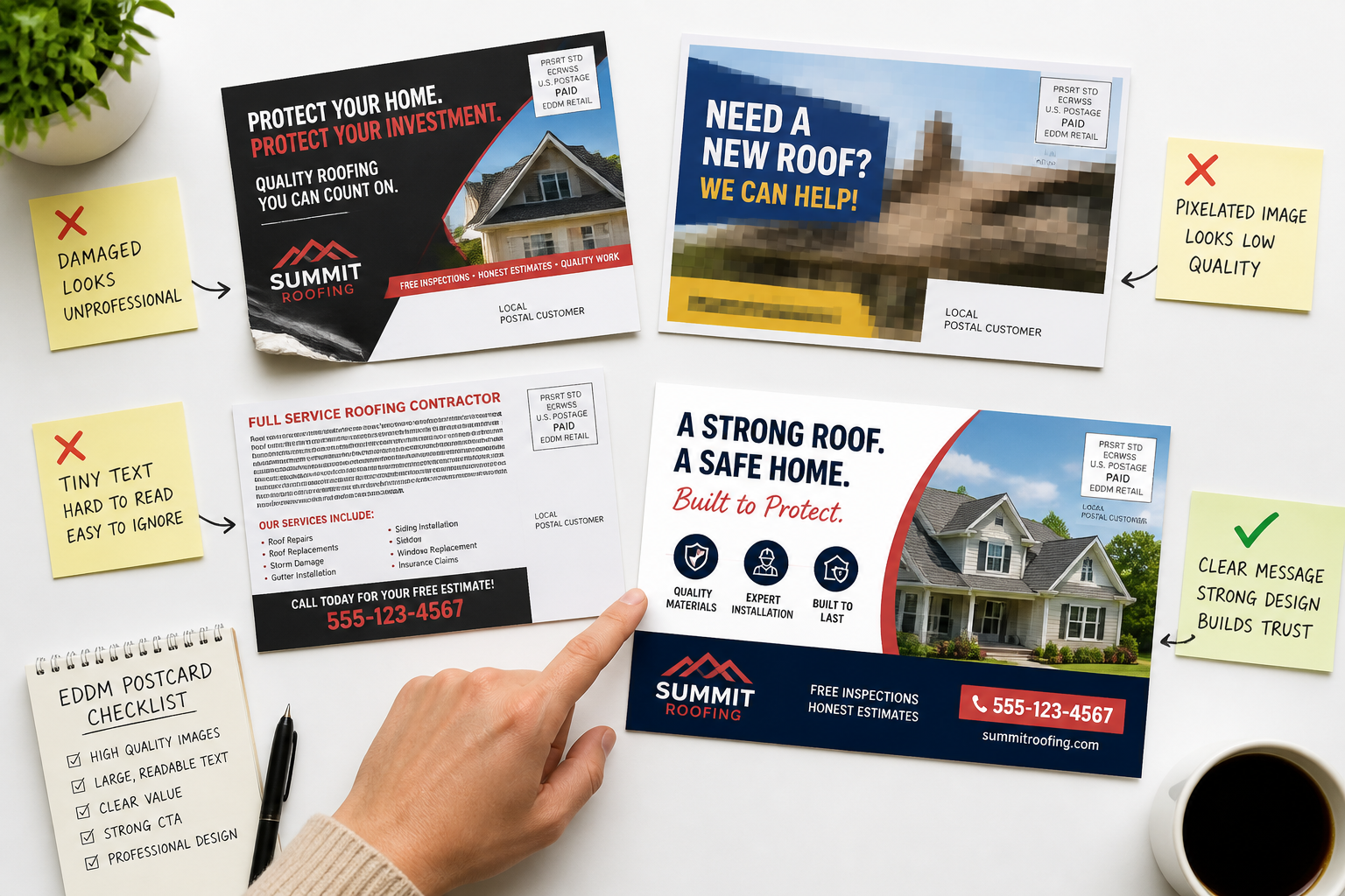
Every Door Direct Mail (EDDM) postcards offer a cost-effective way for small businesses to reach specific local audiences without needing a mailing list. When executed well, EDDM can drive local foot traffic, generate leads, and build brand awareness. However, the success of an EDDM campaign hinges significantly on the postcard's design. A poorly designed postcard, even with perfect targeting, will struggle to capture attention or motivate action.
Many businesses invest in EDDM campaigns but overlook critical design elements, leading to suboptimal response rates. This article outlines common design mistakes that can severely impact your EDDM postcard's effectiveness. Understanding these pitfalls and implementing corrective strategies will help ensure your direct mail investment yields the best possible returns.
Mistake 1: Unclear or Missing Call to Action (CTA)
One of the most frequent and damaging mistakes is failing to provide a clear, compelling call to action. A postcard without a direct instruction leaves the recipient wondering what to do next. Vague phrases like “Learn More” or “Visit Us Today” often lack the urgency or specific benefit needed to prompt immediate action. The CTA should be easy to find, understand, and act upon.
To avoid this, define your primary objective for the postcard before design begins. Do you want them to visit your store, call for a quote, scan a QR code, or visit a specific landing page? Once clear, craft a concise CTA that highlights a benefit or creates urgency. "Get 20% Off Your First Purchase - Bring This Card!" or "Schedule Your Free Consultation - Call Now!" are examples of effective, benefit-driven calls to action. Ensure the CTA is visually prominent, perhaps in a contrasting color or larger font, and repeated if space allows.
Mistake 2: Overcrowded Layout and Information Overload
Postcards are designed for quick reads, not detailed brochures. Cramming too much text, too many images, or too many offers onto a small postcard overwhelms the reader. This leads to visual clutter, making it difficult to discern the main message or the CTA. Recipients will likely glance at an overcrowded postcard and discard it immediately.
The solution is to embrace white space. Focus on one primary message and one or two compelling offers. Use concise headlines and bullet points instead of long paragraphs. Select high-quality images that reinforce your message without dominating the space. Remember, the goal is to pique interest enough to prompt the recipient to take the next step, not to provide every detail about your business. Our design team often advises clients to prioritize clarity and impact over comprehensive information for EDDM pieces.
Mistake 3: Poor Contrast and Illegible Typography
Legibility is paramount for any printed material, especially a direct mail piece like an EDDM postcard. Using low-contrast color combinations, such as light gray text on a white background, or dark blue text on a dark green background, makes your message hard to read. Similarly, choosing overly decorative, small, or all-caps fonts for main body text can deter readers. Many people will not strain their eyes to decipher an advertisement.
Select font styles that are clean, professional, and easy to read at a glance. Opt for strong contrast between text and background colors. Dark text on a light background, or vice versa, typically works best. Use font sizes that are appropriate for a postcard – headlines should be large and impactful, while body text should be at least 10-12pt. Test your design by printing a draft and reviewing it from arm's length to ensure readability.
Mistake 4: Weak or Irrelevant Imagery
Visuals are often the first thing a recipient notices on a postcard. Using low-resolution, generic stock photos, or images that don't directly relate to your offer or brand can instantly undermine your message. A blurry image or one that doesn't resonate with your target audience will fail to capture attention or convey professionalism, leading to immediate disengagement.
Invest in high-quality, relevant photography or professional graphics. Images should support your message, showcase your products or services, or evoke the desired emotion. For instance, a local restaurant might feature an inviting image of a signature dish, while a landscaping company could display a vibrant, well-maintained yard. Ensure all images are high-resolution (300 DPI for print) to avoid pixelation. Our commercial printing processes ensure your images look crisp and professional when properly supplied.
Mistake 5: Neglecting the Back of the Postcard
Some designers treat the back of the postcard as an afterthought, using it primarily for the mailing indicia and address area with minimal design. This wastes valuable real estate. The back of the postcard provides an additional opportunity to reinforce your message, provide additional details, or offer a secondary call to action.
Utilize both sides of your EDDM postcard effectively. While the front grabs attention, the back can provide supporting information, testimonials, a map to your location, your website, social media handles, or details about the offer. Just like the front, keep the back uncluttered and legible. Ensure a consistent brand identity across both sides. Remember, the recipient will often flip the card over if the front captures their interest.
Frequently asked questions
- What is the optimal size for an EDDM postcard?
- The U.S. Postal Service (USPS) has specific size requirements for EDDM mailings. Postcards must be larger than 6.125 inches high or 11.5 inches long, but not exceed 12 inches high or 15 inches long. Common effective sizes include 6.5" x 9", 8.5" x 11", and 6" x 12".
- Should I include a QR code on my EDDM postcard?
- Yes, a QR code can be an effective addition, providing a direct link to your website, a specific landing page, or a special offer. Ensure the QR code is large enough to scan easily, contrasts well with its background, and leads to a mobile-optimized destination.
- How many offers should I include on one EDDM postcard?
- To maintain clarity and prevent information overload, it's generally best to focus on one primary offer. You might include a secondary, related offer if it doesn't detract from the main message and can be clearly communicated without cluttering the design.
- What are common paper stock options for EDDM postcards?
- Standard EDDM postcards are typically printed on sturdy card stock, such as 14pt or 16pt C2S (coated two sides). A gloss or UV coating can enhance color vibrancy and provide durability, making the postcard feel more substantial and professional. Odd Jobs Media offers a range of card stock and finishing options for EDDM.