Business Cards
How to choose business card stock that feels right
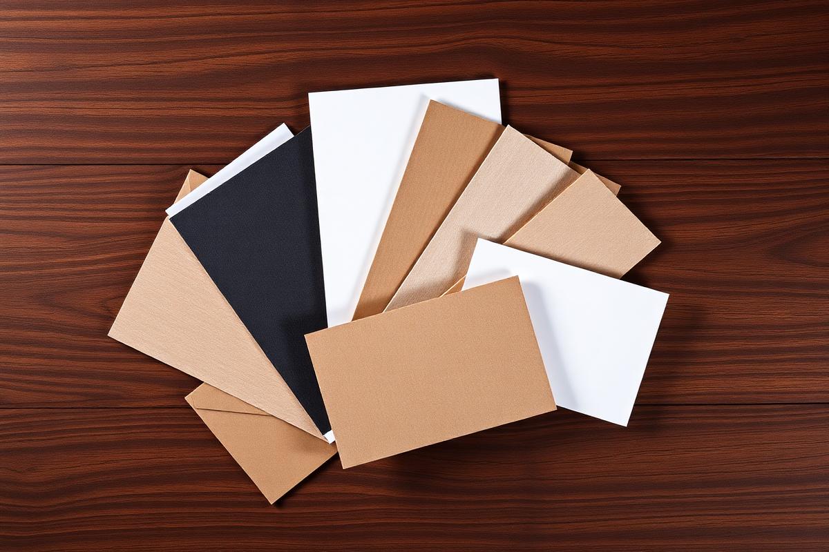
Business cards still work because they give a prospect something physical to keep. In a world of forgettable email signatures and LinkedIn requests, a well-made card lands in a wallet, a desk drawer, or a pocket — and it keeps working for weeks after the conversation ends.
The tricky part is that most people order cards based on price alone and never think about the paper. Stock, finish, and coating quietly shape how your card feels the moment someone picks it up. That first tactile impression sets the tone for how the rest of your brand is perceived.
Understanding paper weight (gsm and pt)
Paper weight is measured either in grams per square meter (gsm) or points (pt), and both describe how thick and rigid the stock will feel. A standard business card runs around 300–350 gsm (roughly 14 pt), which is sturdy enough to survive being carried around but thin enough to fit comfortably in a wallet.
Premium cards typically start at 400 gsm (16 pt) and go up to 600+ gsm (32 pt) for ultra-thick, luxury pieces. The heavier the stock, the more the card signals intention — it feels deliberate, not disposable. If your brand competes on craft, quality, or price point, the extra weight is one of the cheapest upgrades you can make.
There's a practical ceiling, though. Cards above 24 pt won't fit neatly into most card holders and can look showy in industries where restraint matters. Match the weight to the room you're walking into.
Coatings: gloss, matte, soft-touch, and uncoated
Gloss coatings make colors pop and resist fingerprints well, which makes them a strong choice for photography-driven brands or cards with bold imagery. The trade-off is that gloss can feel a bit generic — it's the default finish most people expect.
Matte coatings feel more modern and understated. Colors sit slightly muted, but text is easier to read and the surface takes pen ink if you ever need to write on the card. Matte pairs especially well with minimalist design and typography-forward layouts.
Soft-touch (also called velvet or suede) is the finish people remember. It has a subtle, almost peachy texture that feels expensive the moment it hits your fingers. It's more expensive to produce but disproportionately effective for premium positioning.
Uncoated stock has no film at all — just paper. It feels warm and organic, works beautifully with debossing or letterpress, and takes handwritten notes cleanly. It's the natural fit for craft businesses, studios, and brands that want to feel handmade.
Specialty finishes worth considering
Spot UV adds a glossy, raised layer on specific parts of the card — usually a logo or a headline — while the rest stays matte. The contrast between finishes creates visual and tactile interest without changing the base design.
Foil stamping (gold, silver, copper, or holographic) applies metallic film under heat and pressure. It photographs beautifully and adds real perceived value, which is why it shows up so often on luxury and hospitality brands.
Edge painting and edge printing let you add a strip of color along the sides of a thick card. It's a small detail, but on a 32 pt stock it turns the card into an object people notice.
Die-cut shapes, rounded corners, and unusual sizes are all worth exploring when the goal is memorability, but confirm with your printer that the final card still fits standard wallets if that matters to your audience.
Matching stock to how the card will be used
For high-volume networking — trade shows, conferences, cold outreach — durability matters more than luxury. A 16 pt coated card holds up in a lanyard pouch and doesn't dent when it gets shuffled around.
For referral-driven or relationship businesses, the card is usually handed over in a moment that matters. A thicker stock with a soft-touch or uncoated finish makes that handoff feel intentional and worth keeping.
For teams, consistency across the whole card kit matters more than any single upgrade. Pick one stock and finish combination and stick with it across every team member — that repeatability is what turns a business card into a brand asset.
Frequently asked questions
- What thickness is considered a premium business card?
- Anything at 16 pt or above is generally considered premium. Cards at 24–32 pt feel noticeably luxurious and are commonly used for hospitality, real estate, and creative brands.
- Can I write on a coated business card?
- Gloss and soft-touch coatings resist pen ink. If you or your customers will write on the card, choose matte or uncoated stock instead.