Marketing Materials
10 Rules of High-Conversion Print Flyer Design
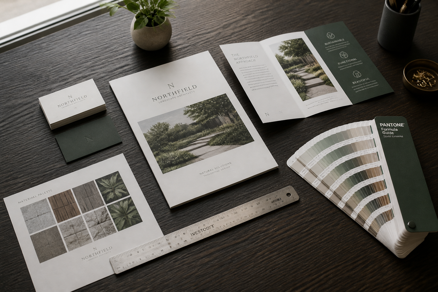
Print flyers face an immediate hurdle: the walk between the pickup point and the recycling bin. If your recipient cannot determine what you offer and why it matters within three seconds, the piece fails. Designing for print requires a different discipline than designing for digital screens because you have a single physical plane to command attention, build credibility, and drive a measurable response.
High-converting flyers rely on structured visual mechanics rather than decorative flourishes. When service providers, retailers, and event organizers see low response rates, the issue is rarely the physical medium itself. The breakdown almost always stems from cluttered layouts, buried contact points, or poor print specifications. Applying ten core layout, copy, and prepress principles will turn your direct mailers and counter handouts into reliable lead generators.
Establish a Single Focal Point and Lead With the Benefit
Rule 1: Establish one dominant focal point. Every effective flyer needs an unmistakable visual anchor that claims at least thirty percent of the layout. When headlines, discount badges, and multiple photos fight for equal prominence, the human eye skips the entire page. Choose a single high-resolution image or an oversized type treatment to pull the reader in first.
Rule 2: Lead with the customer outcome, not your business name. Your logo belongs in a supporting position, typically in the lower corner or top margin. Prospective clients care about their own problems, not your corporate identity. Replace generic business headers like 'Smith Plumbing Services' with a direct benefit headline such as 'Emergency Water Heater Replacement Within Two Hours.' Make the headline address a specific pain point or tangible advantage before introducing who you are.
Structure the Eye Flow and Defend Negative Space
Rule 3: Build a structured reading path using natural eye movement patterns. Western readers scan print in either a Z-pattern across balanced fields or an F-pattern down text-heavy columns. Position your primary visual hook at the top, support it with concise qualifying details in the center, and place your action prompt at the bottom right. Avoid scattering disparate design elements across the page in an attempt to make the layout look energetic.
Rule 4: Protect negative space aggressively. Clutter is the primary reason print collateral gets discarded. White space—or empty space in dark backgrounds—is not wasted advertising real estate; it is the visual buffer that makes your text legible and gives key offers room to register. Aim to leave at least twenty to twenty-five percent of the page free of text, icons, and background noise so the essential details remain distinct.
Control Typographic Hierarchy and Information Density
Rule 5: Limit your typography to two typeface families. Use one clean sans-serif font for body copy and subheadings, paired with a sturdy serif or heavy sans-serif for the primary headline. Combining three or more typefaces makes a business look amateur and disrupts scanning speed. Within those two families, establish clear hierarchy through disciplined variations in weight and point size rather than switching fonts.
Rule 6: Format text for rapid scanning. Nobody reads paragraphs on a promotional flyer. Condense your message into scannable chunks using bullet points, short subheads, and bolded lead-in phrases. Keep body copy between three and four lines per block, and restrict bullet lists to five items or fewer. If an explanation requires multi-sentence narrative, direct the prospect to your website or a consultation call instead.
Engineer Direct Response Calls to Action
Rule 7: Isolate a single call to action. A flyer should ask the reader to take exactly one primary step. When you include phone numbers, website URLs, three social media handles, an email address, and a physical location, response rates drop because the next step is ambiguous. If your goal is phone inquiries, emphasize the phone number in large, high-contrast type and keep secondary links discreet.
Rule 8: Pair the action with an incentive and clear urgency. General invitations like 'Contact us for more details' produce poor conversion rates. Give the recipient a tangible reason to reach out now. Combine a specific offer, such as a waived diagnostic fee or an introductory discount, with a distinct expiration date. Trackable promo codes and dynamic QR codes allow you to measure exactly how many calls your print run produced.
Master Technical Prepress and Material Selection
Rule 9: Build files strictly to commercial print specifications. A visually appealing layout will fail if the finished print is blurry, cut incorrectly, or color-shifted. Design your artwork at full scale at 300 DPI in the CMYK color space. Always incorporate an industry-standard 0.125-inch bleed around all outer edges, and keep critical text at least 0.25 inches inside the cut line to prevent accidental trimming during finishing.
Rule 10: Choose paper stock that supports your market positioning. A high-end service printed on flimsy 50lb offset paper signals cheapness before the prospect reads a single word. Standard commercial flyers should run on at least 100lb gloss or matte text for handouts, or 14pt to 16pt cardstock for pieces intended to sit on counters or travel through direct mail. The tactile weight of the sheet provides an immediate unconscious signal of your operational quality.
Frequently asked questions
- What is the most effective flyer size for generating customer phone calls?
- The standard 8.5x11 inch sheet folded to a half-page or an untrimmed 5.5x8.5 inch format provides the best balance between design space and handling ease. Half-page flyers are compact enough for recipients to save on a refrigerator or desk, while still offering sufficient room for a clear headline, bullet points, and an oversized phone number.
- Should I put a QR code or a phone number on my flyer?
- Display both, but give visual priority to the action your customers prefer. For emergency trade services like plumbing or towing, an oversized phone number must dominate the CTA section. For appointments, menus, or portfolio reviews, a high-contrast QR code paired with a short vanity URL provides an immediate digital bridge for smartphone users.
- What paper weight should I order for commercial business flyers?
- For bulk handouts and door-to-door distribution, 100lb gloss or matte text provides professional durability without excessive postage or production costs. For point-of-sale displays, business-to-business leave-behinds, or standalone direct mail, upgrade to 14pt or 16pt cardstock so the piece resists bending and conveys higher production value.